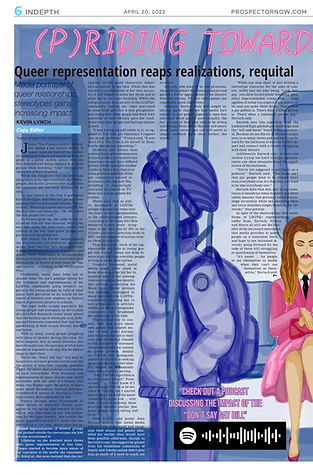
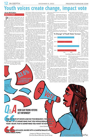
Design Work
This is a sampling of much of my newspaper design work, created entirely in Adobe InDesign and Photoshop.


Design Process

"Dummy" Layouts
This was a concept for the overall page design for the in-depth spread on student patriotism from Issue #3 of this year. I created this mock-up in Notability with input from my fellow editor-in-chief, whose story was running on the leftmost page, and sent it to the cartoonist who was assigned to draw the art for these pages.


Rough Outlines
After pages have been "dummied," they can then be roughly constructed to give designers and editors an idea of how text, visuals, stats and more will all fit onto the final page long before a pages' art is finished.


Editing/Revising
Once a page has its stories finalized and a completed visual for the layout, it goes through a minimum of three edits, or "reads," in which each read is completed by progressively more experienced and higher-ranking staff members to ensure that every page is receiving equal manpower and effort.


Final Product
After a page has gone through a minimum of three reads and has been given one more pass to catch any final, glaring errors, the page is sent out to press.
Other Design Work
I have always believed that interesting and engaging design work is just as important on a small scale as it is for the overall page or spread design. Thus, whenever I am designing a page or brainstorming main art for a story, I always have a mission in mind to come up with some smaller visual that will complement the design as a whole while also providing its own unique visual flair and creatively displaying new information.
While these are many of my personal favorite examples from my design work, helping other staff members conceptualize and design their own smaller visuals for a page can be equally rewarding: because they are so often a matter of brainpower rather than actual manpower, helping newer staff members create their own side visuals can be a great way to boost their page-designing confidence and help them feel proficient with their skillset (in addition to providing more varied design in our paper!).


Web/Photoshop Design
When I created my ranking list of all 75 new releases that I watched in 2022, I knew that I would need an interesting and eye-catching graphic to accompany it, finally settling on a large, campy conglomerate of various movie characters facing towards the large "2022" in the center.
Over my winter break, I spent roughly half a dozen combined hours cutting out images in Photoshop and arranging them in InDesign --- far more work than I was expecting going in. However, I was left with a final project that I am immensely happy with, one that still shines as one of my personal proudest design accomplishments simply because of how well it executes my initial vision.

While the original Crosspectors from older editions of our paper were often simpler-designed, black-and-white crosswords, I knew that I would have to modernize and add more stylistic flair to the design when adapting it for our modern issues.
Even though I started by establishing a basic template for the crossword with modern fonts and coloring, I knew that smaller images throughout would do wonders to draw readers' eyes to the puzzle and set each issue's crossword apart from the last.
Therefore, I typically play around with various crossword layouts to start before finally settling on one that can accommodate the images I plan to add throughout, such as those in the edition to the right.
